This article is being written because with all the focus on remote working and collaboration tools , if they aren’t fully accessible that excludes certain populations from participating.
One of the largest populations of people with disabilities is those with vision related requirements. If you look at any of the products for people with low vision for example you will find that they always have settings to incorporate customisation of font, foreground color and background color to meet the diversity of vision related needs. Microsoft Windows has since it’s very early days supported themes and custom font, color and background color choices through their theme system and shipped the ability to customise these settings and even flag to aps through the registry that this choice is enabled because you need it.
In our userbase we have 100s of users who make use of the built in ability in Windows to create your own custom color scheme. For some it’s because they have low vision and require a highly contrasting color scheme. For some it’s because of their vision needs that they have trouble seeing certain colors or that different brightness levels effect their condition. Many users don’t want an absence of color they want to pick their color scheme. For some such as those who’ve had concussions and suffer symptoms of it afterwards, it’s that they need low brightness but high contrasting colors. Regardless, many users need these features that are built into windows.
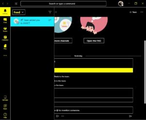
All of windows and the rest of the Microsoft office suite support this. However; in microsoft teams it only applies it’s own color scheme rather than the user’s 1. The bright yellow is too bright and bright blue is too bright that some users cannot use the app because of it.
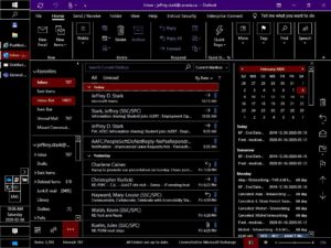
I’ve pasted screenshot’s below that show and explain what I am talking about. In the below example, the user has chosen a black background, buttons have a black background, selected text has a dark red background and bright text and the rest of the interface is white text on a black background. You will see in the screenshots below that Windows, Office, Edge and many other apps apply this color scheme correctly but Microsoft Teams does not.
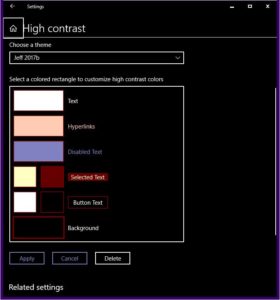
Here is the user’s chosen color scheme:
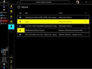
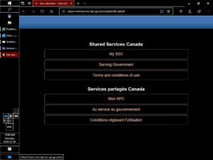
Here are some samples of apps applying the correct color scheme:
Now here is Microsoft Teams not applying the user’s choices correctly: