If you look at all the products out there for partially sighted people it becomes very obvious that they all have a mechanism for presenting you with bright text on a dark background. You will also notice that some of the recent operating systems have attempted to bridge the gap of what a low vision user needs by providing an inverting mechanism of the standard theme that the operating system uses rather than having a mechanism for controlling the theme itself. In this article I am going to attempt to explain why that approach is inferior and to many low vision users seems like (to quote a friend of mine) a “sighted person’s approach to solving a problem without really understanding the population that needs the feature”.
First off, let’s define the requirement. The reason the high contrast theme is needed is because when you look at a screen with a black background and bright text, the only thing throwing light at your eye is the content (text, pictures, buttons, etc). This does not mean that the person wants no color, simply that the color presented be on functional content.
I am a perfect example of someone who needs a high contrasting color scheme to be able to effectively use an interface.
On the PC I use a combination of speech output, magnification and high contrasting colors. If I use a white background with black text I require 12x-14x magnification (and can barely read it); however, if I use white text on a black background I only require 4x-6x magnification to read the same information. So, as you can see, that black interface is tremendously important to me.
I am of course not the minority in this area, as one just needs to look at the most common features designed for low vision users built into CCTVs, Screen Magnification software and various Operating Systems and the majority of these features revolve around setting background/foreground colors and font sizes.
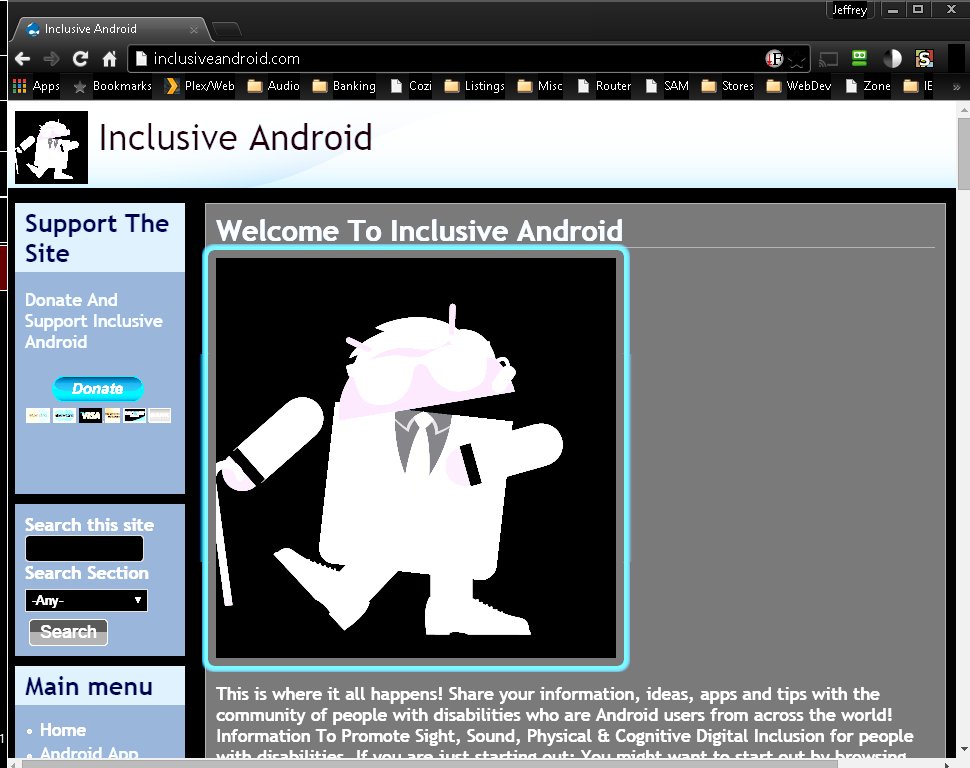
To give you a sense of what role the text and color play in finding things on a screen, I’ve blurred a screenshot of a phone that had a high contrast scheme to simulate vision loss. Even though you cannot make out the text clearly in the screenshot, you can easily identify where there is text and buttons.

So, now you might highlight that iOS, Android, Blackberry and magnification software on windows have an “invert” feature. the “inverting” functions you find in screen magnification software, (such as Zoomtext), on some browsers like Chrome or on certain devices like the iPhone are useful in very very limited situations. Colors invert but the setting doesn’t deliver a true white on black color scheme. In addition to this, the inverting function creates an unusable color combination if a screen within an application or a webpage is gray or black. Finally, inverting also usually inverts pictures and photos, making friends and family look like aliens.
To give you an example of what I am talking about, here are 2 different views of a website. 1 using the high contrast black color scheme built into windows and 1 using the invert features available in the chrome browser on windows.
As you will note in the above screenshot, everything is readable, the text and graphics are bright and no light is being thrown at the reader’s eyes when it is part of the background. This makes for a clear crisp experience for a low vision user.
Now let’s look at the same site with the invert feature turned on rather than adopting the user’s color scheme:
As you will note, the background remains bright, text is far less readable and the pictures on the website are in some areas unreadable. To enhance the “invert” function some of the systems provide a setting to filter out the color, which for most low vision users removes an important component of the interface and makes it even less efficient to use.
Now if we start talking about mobile phones,
with smaller screens where you have to use the touch screen, that black interface becomes significantly more important because many people with low vision rely less on magnification and rely on voice. However, people with low vision in this scenerio still use sight to speed up navigation and follow what’s going on, on the screen itself. For example when I can see where buttons are, I can go to them directly with my finger, thus skipping over the linear top to bottom reading that is imposed by default with a screen reader and instead moving directly to the object I want.
Google, despite having a Theme engine and system for implementing for low vision users an operating system level high contrast theme has failed to do so. Even on operating systems where there is a theme engine (i.e. Windows) they have failed to support the native features of the operating system.
Going as far as having invert functions is not going far enough. Microsoft, Linux, Mozilla and even CyanogenMod seem to understand the needs of the low vision community by all providing mechanisms for people to choose their own colors and set their device in high contrast colors. While Apple, Google, Blackberry and others seem to be trying to build a bicycle for a sea horse.